Browsed by
Category: Features

Announcing An Upgraded Tiingo.com

Announcing An Upgraded Tiingo.com

For the past seven months, we’ve been rebuilding Tiingo.com. As a result, we’ve upgraded Tiingo.com – including the entire front-end engine, as well as much of the back-end. Every line of code was reconstructed with a focus on performance, while also incorporating your feedback, and knocking things off our wishlist that will let us develop features faster for you.

Check out the below for a thorough explanation of what we did – or visit Tiingo.com to experience the changes right away.

Enjoy!


Announcing Tiingo Version 2

Our goal for the below will be to show the visual result as well as share some of the reasoning behind those decisions.

It makes me happy and excited to see the new features and layout, and I hope the below will show you how much care we took to make this new version consistent with our values.

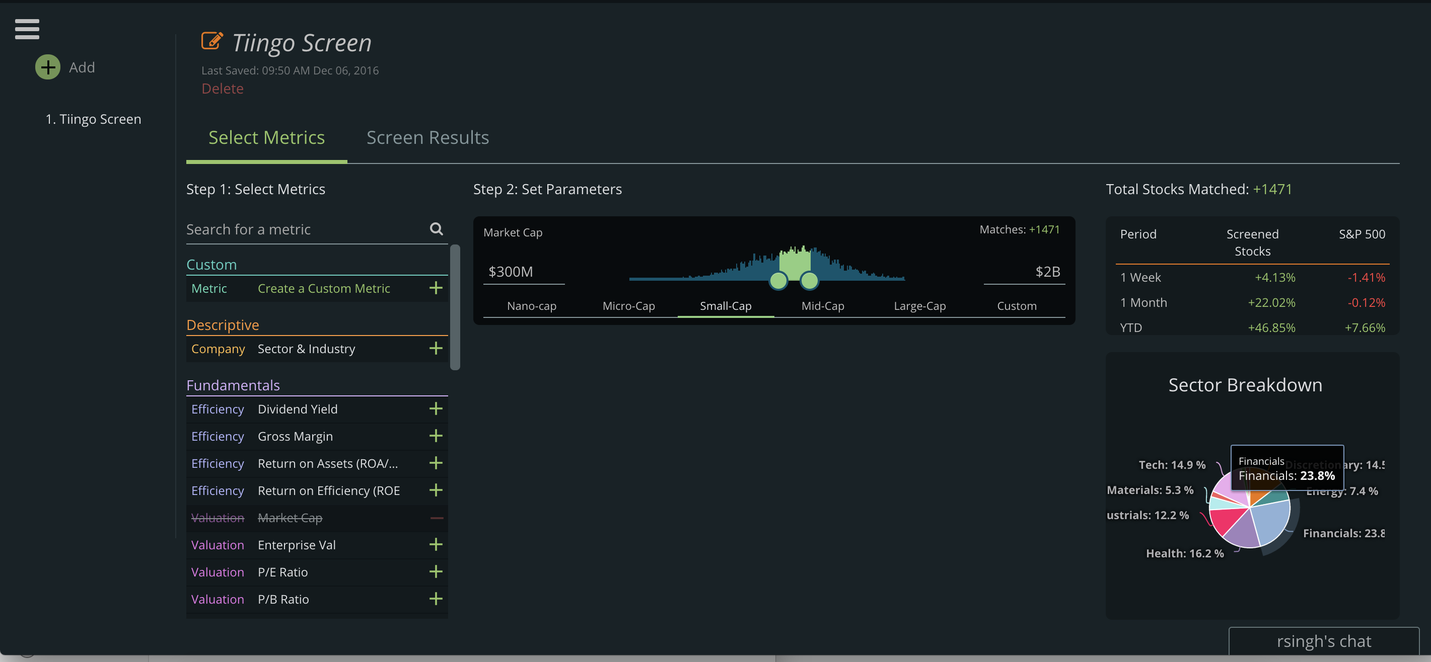
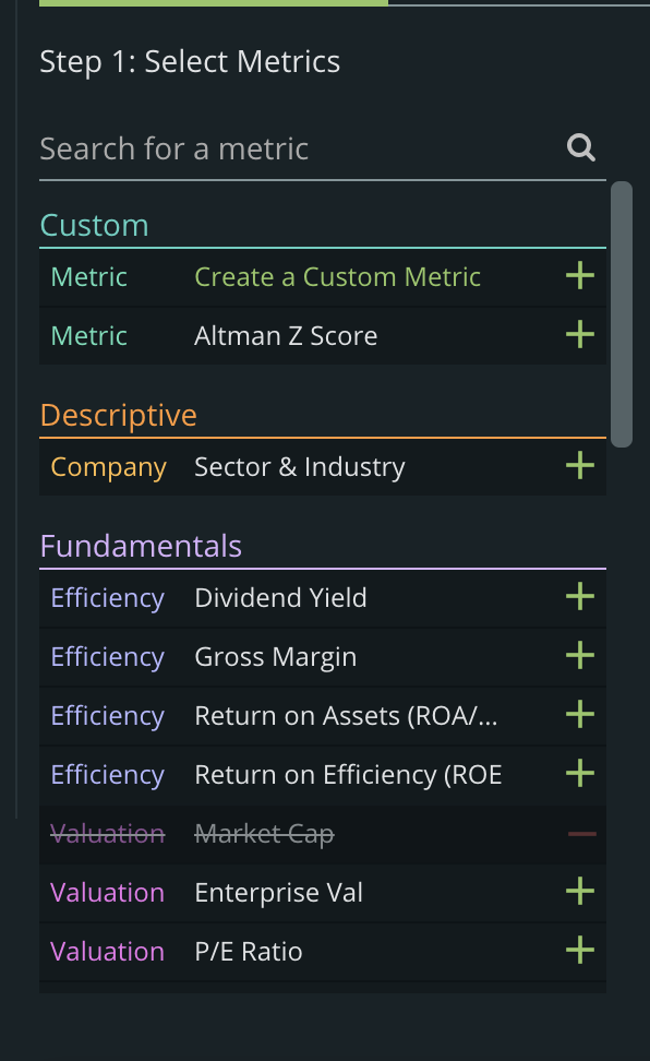
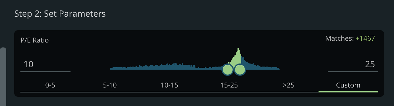
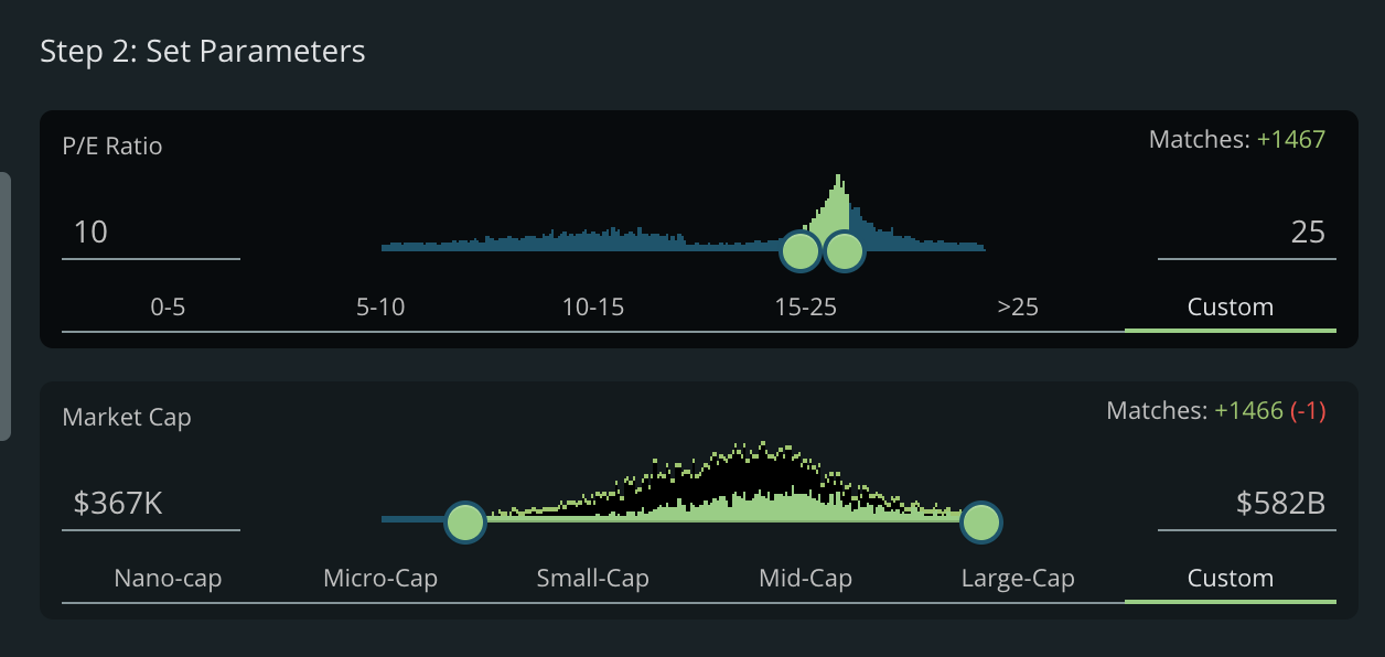
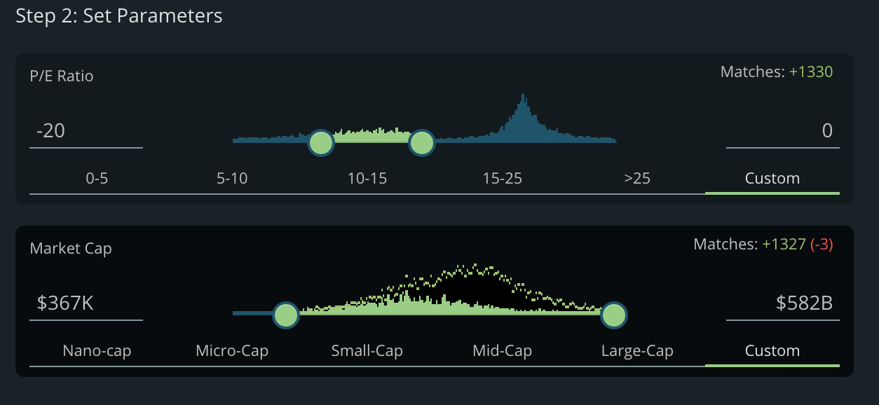
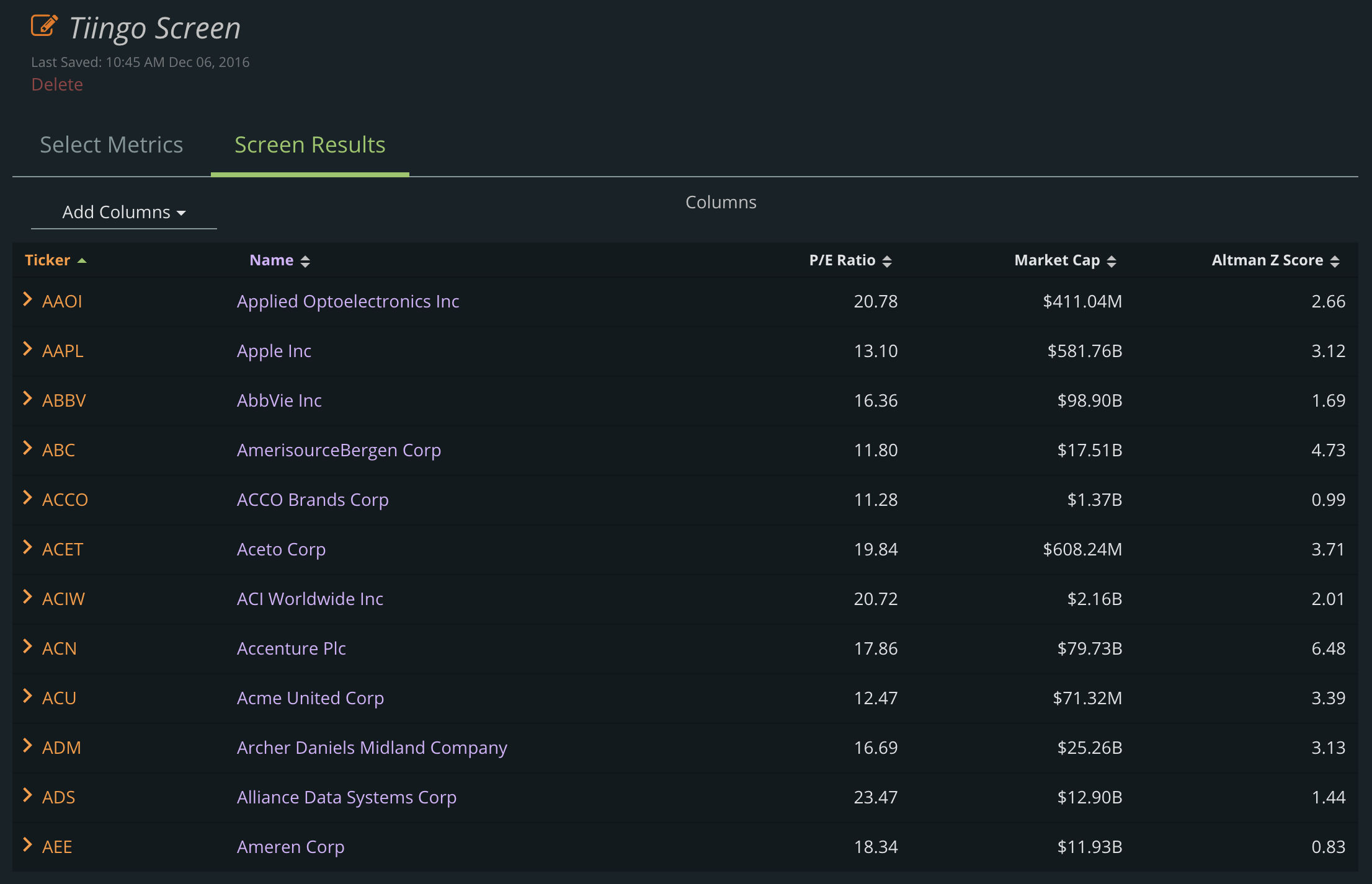
Color Scheme and Organization

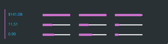
Our UI was rebuilt to help focus the eyes onto relevant pieces of information you may be looking for. Additionally, the colors and format were rebuilt to make consistency a priority. This will allow you to match functionality with colors.

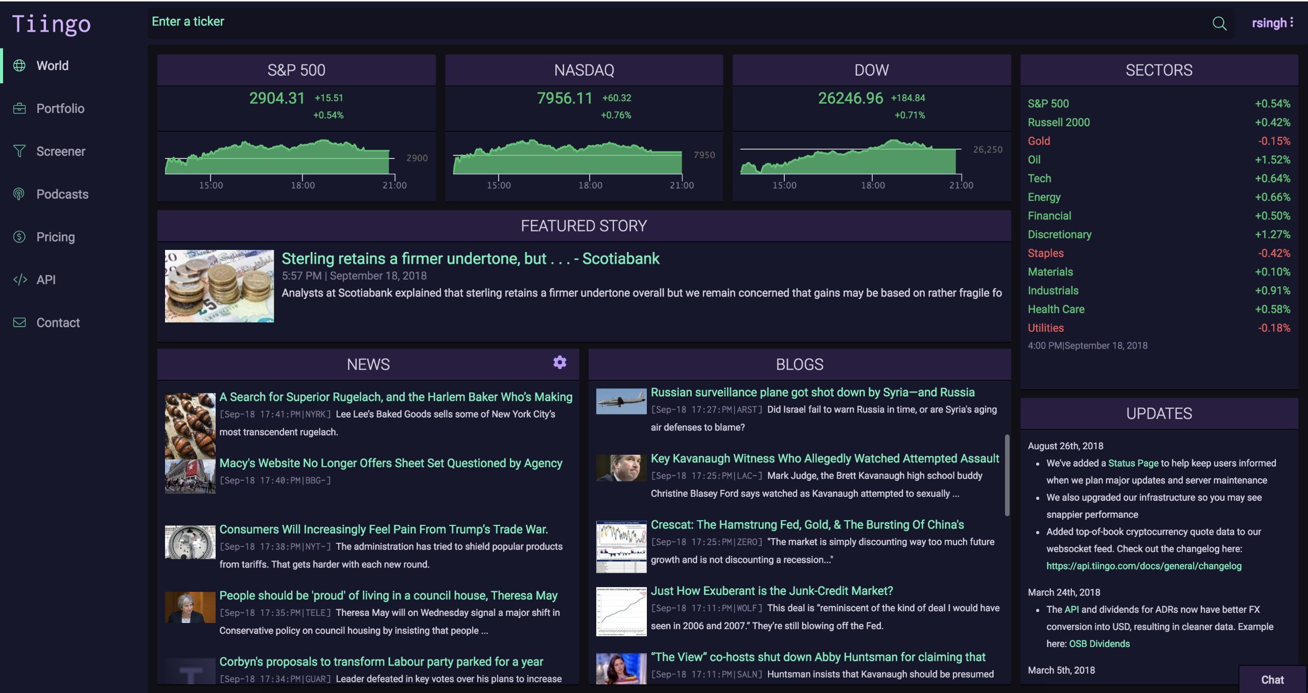
Here is a zoomed out picture:


You will now see each segment of information contains a header, and the body of the segment has a separate background. These are a few visual techniques to keep the information clean and separated.

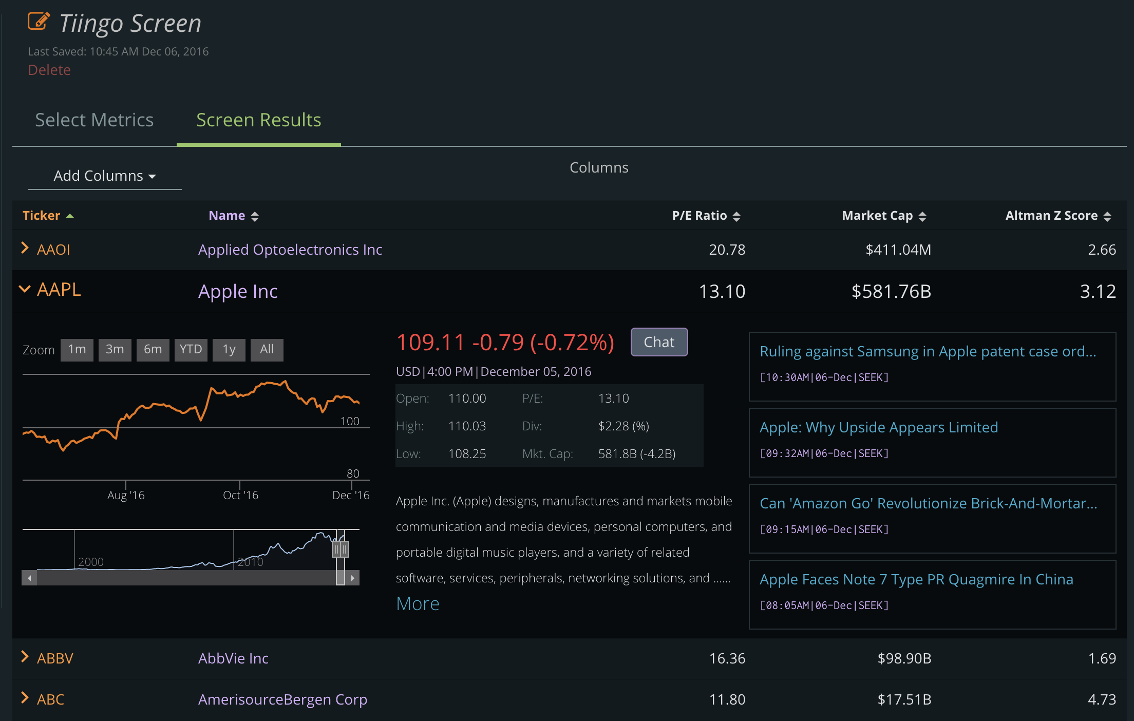
The most obvious example of this is on a stock’s overview page. The first image is the new UI (V2) and the second picture is the old UI.

None of the changes we’ve made are to keep you on the pages longer. In fact, we hope your eyes follow the information you’re looking for and therefore let you navigate through the data even faster.


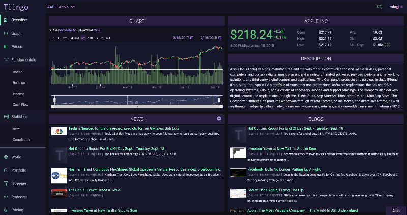
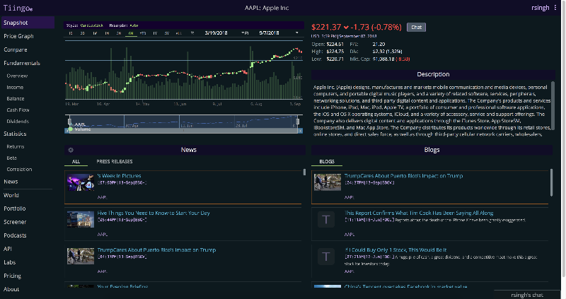
See the example here: https://www.tiingo.com/aapl/overview


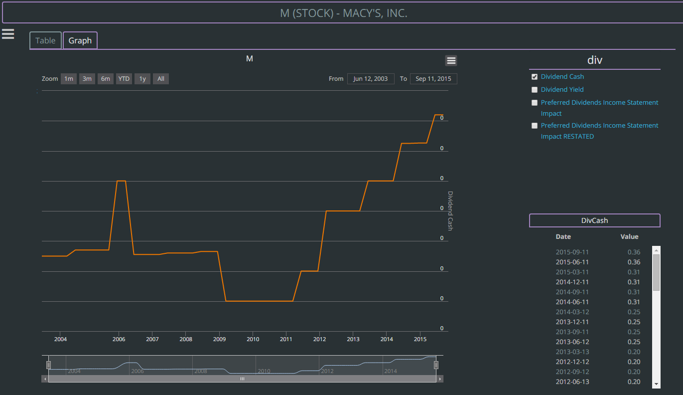
Another example is how we hide the dividend values for days where no dividend is paid. This has two benefits:

  1. It helps hide repetitive nonsignificant information.
  2. It means that when dividends are paid, they stand out.

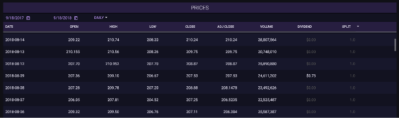
See the example here: https://www.tiingo.com/aapl/prices

These are just two small examples of the considerations that went into the redesign. You will find many of these types of changes all over the new Tiingo.com


User Experience

We incorporated a number of features based on your suggestions that make your workflow easier.

For example, now when you look up the fundamentals for a particular stock, then change the stock in the top bar, we keep you on the same page. This means if you have gotten the fundamental data configured for a few particular dates, then you change the ticker, we keep your configuration options the same and pull data for those dates for the new ticker.

This makes comparing data across dates much quicker.


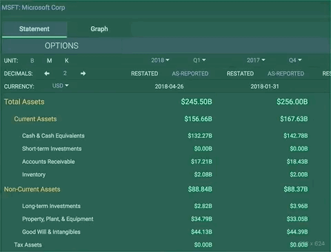
See the example here: https://www.tiingo.com/msft/fundamentals/balance-sheet


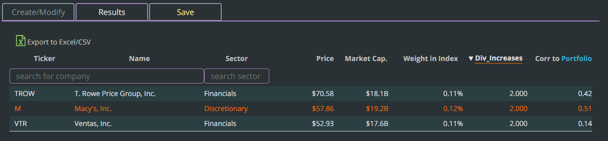
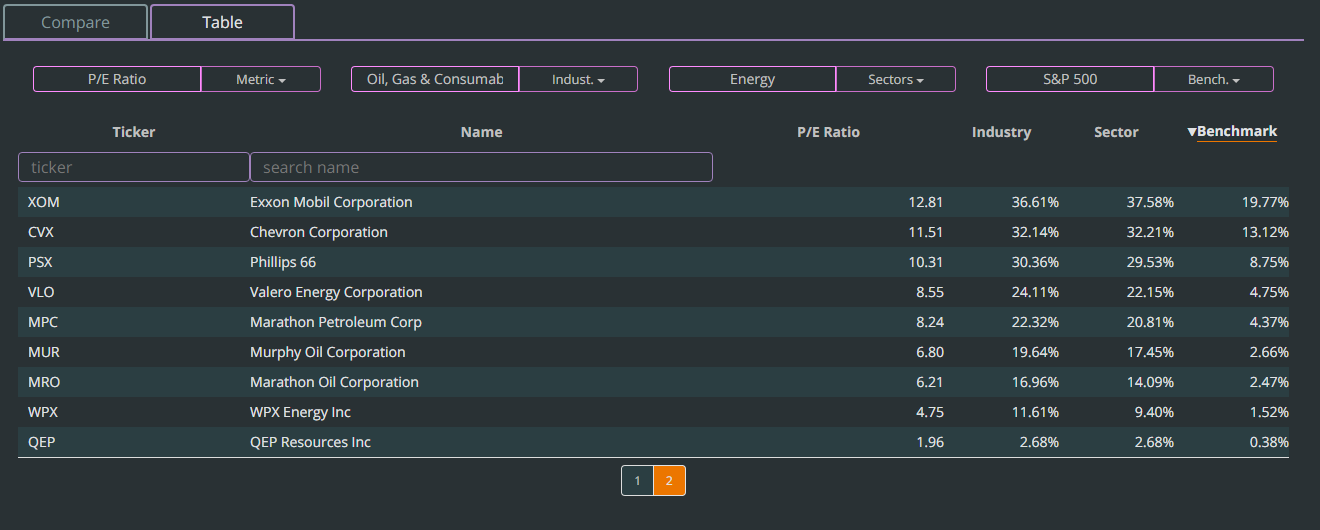
We learned that many of you keep multiple portfolios and run different analysis on each one. So we made Portfolio selection a much easier process. Now you can easily click between portfolios on the left-hand bar and compare stats across each one through a single click.


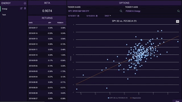
See the example here: https://www.tiingo.com/portfolio/statistics/beta


Throughout the entire platform you will notice a massive speed boost. We rebuilt our entire codebase from the ground up and also migrated from AngularJS to Angular 6

These are just a few changes we made that will make your experience better. As you use Tiingo, you will find more of these improvements.


New Features

While this UI update was primarily focused on migrating existing functionality, we added a couple new features throughout Tiingo. Here are two of them:

For ETFs and Mutual Funds we created a better way to see graphs of how fee expenses have changed over time. Our goal is to highlight when companies are doing something funny with their fees and also to spot trends over time.

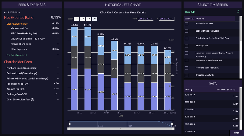
See the example here: https://www.tiingo.com/xlk/funds/fees-and-expenses


We’ve made our billing process more transparent with an entirely new billing system.

With the new billing UI, you can view your past invoices and easily change your subscription plan to one that fits your needs.


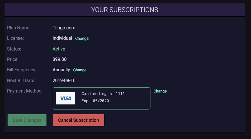
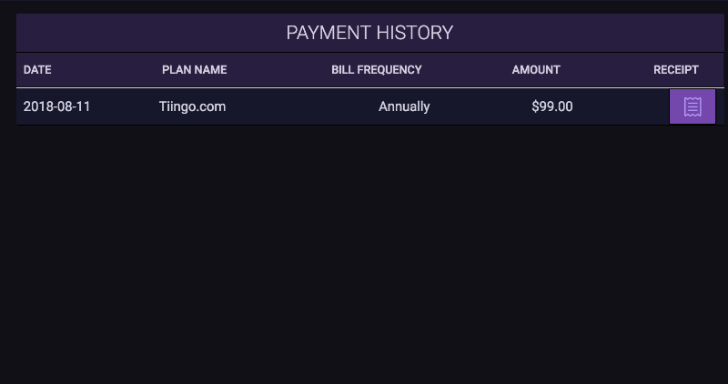
See the example here: https://www.tiingo.com/account/billing/current-plan


We’ve added small tweaks and new features all over the site. For example, you can now view your API usage and token on Tiingo.com in addition to the API, and we also changed the way you graph fundamentals to make it easier to compare values. Visit Tiingo.com to see all of the changes.


Thank You


Thank you all for being such wonderful users. We look forward toward our continued growth into 2019 and we know this can only happen with a firm foundation: a kind and growing userbase, a firm technical footing, and a happy, loving team.


All the best,
The Tiingo Team

Facebooktwitterredditpinterestlinkedinmail
Making the World’s Best Screener for Our Users Pt. 1

Making the World’s Best Screener for Our Users Pt. 1

It is over a year ago Tiingo launched it’s first screener. We were attempting to move forward the power of screeners, and we had a grandiose ideas of how to do it. We were the first to:

  1. Allow users to create their own metrics
  2. Created a new UI that challenged existing assumptions of screeners

We’re never happy with the status quo, so we decided to challenge ourselves further. We were going to make the custom metrics more intuitive, the screener more informative, and the user experience so intuituve –  you would have no idea that you just screened through ten million datapoints because it took 200ms.

Announcing: The Sexy, Newly Revamped Screener:

Tiingo Screener

The New Notebook

We’ve consolidated the screener overview page into a notebook format. This allows for easy switching among screens and reduces clutter while saving you clicks. We strive for beautiful minimalism here at Tiingo:

Tiingo Screener Notebook format

Searchable Filters

While the old drag and drop was nice, we wanted to come up with a new way to add/remove filters. We’ve created a beautiful searchable table, organized by the type of metric.

Metric Selection Table

Shifting Distributions

We believe data visualization should be done with a level of minimalism. We don’t want charts for the sake of charts. And research has shown time, and a time again, less is more when conducting analysis with numbers.

So we started off with the concept that when somebody screens, they should have context.

Is a filter for a P/E Ratio between 10-25 too common?

PE Between 10 and 25 with Distribution

But that wasn’t enough.

If we’re looking at a PE Ratio of 10-25, what kind of companies are we choosing? Are they small-cap or large cap? The Market Cap distribution has shifted and we want to know that.

Announcing:

The Shifting Distribution

pe-10-25-market-cap

We can see that a P/E of 10-25 leans slightly toward larger companies.

How about a P/E ratio of -20-0.

PE -20 to 10 Market Cap

The distribution has switched largely to smaller Market Caps.

Suddenly, you now have context into all of your screening metrics. And the best part? It’s all done in a flash of a second. If you don’t believe us – check it out here (no registration required): Tiingo Screener

The Results

We wanted our users to be able to see the latest data – quickly. Now the results show you metrics seamlessly and beautifully:

Screen Results

And you can simply click to see more about a company:

Screen Results Expanded

We know you’re going to love this new screener: Tiingo Screener

Facebooktwitterredditpinterestlinkedinmail
Launching the Tiingo Open Data Initiative

Launching the Tiingo Open Data Initiative

Since day one, Tiingo has been committed to providing you with top quality data that is more accurate than companies charging $30k+ a year.

How in the world is a company with a “set your own price” model going to pull this off?

Because we’re going to do something unheard of.

Presenting the Tiingo Open Data Initiative

Sound sexy?

No? Good, because clean data should be boring. Except we’re still going to try and make it sexy (we like doing the impossible).

aapl div


We’ve all been there, looking at a number on a financial tool and wondering, “is that number actually right?” Then we might go to another website or source and double check. Even if we see two equal numbers, we think, “hmm… ok.”

And our skepticism is well-warranted. Often there will be 1 or 2 main vendors for the same source of data. If one vendor is wrong, then many financial sites are wrong.

So what if a company could show you where, when, and how they got their numbers? This is what our Open Data Initiative is about: transparency.

Now within less than a second, you can verify Tiingo’s numbers straight from the official source: press releases. Either hover your mouse over the orange binoculars or click the “Source” link directly to see where, when, and how we got our data.

Try it here:
AAPL Dividend History

Cool huh?

Dividends are just the start.

BUT WAIT THERE’S MORE!
Since the ethos of Tiingo is to “Actively Do Good,” when we are ready we will open all of this data to the world via an API. Right now when we catch mistakes, we are notifying our data vendor so they can fix the data for all their users. We don’t believe in holding good data hostage.

A quick aside: back-populating dividend data and sourcing it is a data intensive process but we are working around the clock to load in this data historically. However, future dividends are being monitored and added in real-time.

From Tiingo with Love

-Rishi


Facebooktwitterredditpinterestlinkedinmail
Screening for Increasing Dividends

Screening for Increasing Dividends

A user asked us if we could allow screening for increasing dividends; but, we figured we’d do one better. What if you could screen for the increases and decreases of any metric? Tiingo now allows this in 3 easy steps.

Step 1: Create a custom metric

To start, visit the custom metrics page here: https://www.tiingo.com/screen/custom

Simply enter the metric you want in the “formula” box. In this example we want to see if the dividend increases, so we type:

“Dividend_Cash”

divcash_premetrictype

But we want to see how many times the cash dividend has increased, so we follow it up with a “.” and use our new metric “.countincr(#)”

The # in this case represents the last # of dividends. Since most dividend stocks pay out quarterly, to see how many times the dividends increased in the past year, we would type in “4” for the #.

Our final formula looks like:

divcashformula

Step 2: Create the Screen

Click “Create Metric” and visit the screening page here: https://www.tiingo.com/screen/

Let’s see how many stocks increased their dividends 2 times or more in the S&P 500. To do that we simply drag-and-drop the metrics we care about and are left with:

final metrics


Step 3: Run the Screen

Click “Run Screen”

We can see there were only 3 stocks that increased dividends 2 times in the last four payouts.

results

Looking at Macy’s we can confirm this on: https://www.tiingo.com/f/g/m

macys div graph


Want to take it further?

Replace “Dividend_Cash” with any metric in our database. Or, replace .countincr with .countdecr and count the number of decreases!


Enjoy! If you have any feedback, reach out to us at [email protected]

Facebooktwitterredditpinterestlinkedinmail
Presenting Tiingo Comparatives: Changing the Way We Compare Companies

Presenting Tiingo Comparatives: Changing the Way We Compare Companies

When you’re about to purchase a stock, you want to make sure you are getting the best deal you possibly can. Often we’ll compare a company to a couple others, and maybe even try to find out general market conditions. But is that P/E ratio of 18 high or low? Context in markets is everything.

For the first time in history, Tiingo now allows you to compare a company across industries, sectors, and benchmarks by letting you see how they rank each day. We provide context at a level of detail nobody else does.

The Result?

Announcing: Tiingo Comparative Analytics
Get the context behind the numbers.
xom main
Check out the analytics for Exxon here: XOM
We designed this feature because we identified two major issues when looking at market conditions and companies.

1) What are current market conditions?

Before making an investment, investors and traders want to know the economic backdrop. Why buy an energy company like Exxon if you know oil is going to collapse? Or, is that P/E ratio high or low? Answering these questions requires us to have context. Many of us use the P/E ratio of the S&P to get an idea of valuations, but does it make sense to compare energy companies with tech?

So we went to the whiteboard –

Instead of comparing everything to the S&P, what if we could compare industries, sectors, and benchmarks?. The current solutions are to use sector-specific indices or ETFs. But even those only cover the largest companies and don’t provide us line-item data. Also comparing Twitter to Microsoft doesn’t make much sense even though they are both in tech. We need industry-specific data too


A quick example:
Let’s say you want to buy an energy company right now because you think oil will go up from here. But, you also want to make sure the company is stable and can weather a storm. So you decide, “let’s look at a big energy company like Exxon Mobil.”

You see the P/E ratio for Exxon is 12.81, which looks reasonable. But you don’t know what the context of that number means, so you take a look!

valuations 36th


We can see within the “Oil, Gas, and Consumable Fuels” industry the P/E is in the bottom 36th percentile. But what about within the S&P 500? The bottom 19th percentile.

But looking to the right of Exxon, we see Chevron (CVX).


valuations CVX


It has a P/E ratio of 11.51, is also a large company, and its P/E ratio is in the bottom 32nd percentile for the same industry. Additionally, it’s P/E ratio is in the bottom 13th percentile in the S&P.

Assuming all else equal, CVX could be a better way to express our play on oil!

Within one screen we could put Exxon’s valuation ratios within the context of the energy sector.


2) Comparing 2-3 companies is good, but we want to know if we’re getting the best deal

We just compared XOM and CVX, but we at Tiingo don’t feel that’s good enough. Industries, sectors, and benchmarks are filled with companies, so shouldn’t you be allowed to see them all?

We love the idea of data transparency.

With a simple click, you can now see all of the data in tabular form.

xom tablular_pe


In the next few weeks, we will be spending time iterating the current product offerings and making existing features more powerful and accurate. If there is something in particular you would like to see, please E-mail us at [email protected]! We love hearing from our users.

Facebooktwitterredditpinterestlinkedinmail
Building the World’s Most Powerful Stock Screener

Building the World’s Most Powerful Stock Screener

I know it’s a bold claim to declare this is the most powerful stock screener out there, so I promise to deliver a bold result. This has been one of the most frequently requested features and for months I struggled with ways to tackle this problem. The end result reenvisions the way we approach screeners to one that is beautiful, intuitive, and has features that nobody has ever seen before.

To check out the screener right away, visit: http://tiingo.com/screen/o

Let’s get into the how and why we made the decisions that we did.

A totally new approach to a UI

A screener is a step in an investor’s workflow and we wanted to capture this. Rather than have a ton of text boxes slapped onto a screen, we took a “stack” approach where users can drag and drop the screens they care about:

drag and drop Drag and Drop Screener


Creation of custom metrics

Because we know we won’t be able to capture every metric people screen for, we allow you to create your own metrics. On our custom metrics page, simply start typing and our entire database of metrics will start to populate.

For example:
Return on Assets (ROA) = Net_Income/Total_Assets

Not only that, you can calculate stats on our fundamental and price data. For example, if we wanted to take an average of the total assets in the past 4 quarters we could do:

For example:
ROA = Net_Income/Total_Assets.mean(4)

A full list of metrics is available on the custom metrics creation screen

Custom Metrics Page


Results are as detailed as you want them to be

Many popular screeners out there won’t show you the values of the metrics you screen for and they don’t let you export to Excel without paying an outrageous fee. Tiingo allows you to do both.

Secondly, since screeners show us stocks we’ve never seen before, how do we learn more? On Tiingo’s screener results page, simply click a company and a box will pop-up showing you a description, a price chart, and the latest news about the company. You never have to leave the results page to learn more about a company.

The Results Page Clicking on Results


Integration into your portfolio

If you notice in the above picture there is a “Corr to Portfolio” column. Tiingo leverages the portfolio tracking tools to integrate into our screener. This column shows you the stock’s correlation to your current portfolio so you can effectively find stocks that offer you the most diversification benefit while staying true to your screening thesis.

Portfolio Correlation column highlighted

Saving screens and metrics

People frequently check screens looking for new ideas, so you shouldn’t have to recreate the wheel every time. You can save both your screens and custom metrics.

Saved Screens Page Saved Custom Metrics Page


Metrics and data not available on any other screener

We are committed to innovating so we wanted to bring important metrics no other platform offered. This includes screens like correlation to global macro factors (Stocks, Treasuries, Bonds, Gold, Oil), and screening not only by an Index (S&P 500, Russell 2000), but also seeing the weight of each stock within that index.

Correlation and Index Weight Highlighted


We deliver on our claims. To check out the screener visit: http://tiingo.com/screen/o

Please note: on the more complicated screens, the calculation may take a few seconds. This is because we hit our most recent data directly, so the values you see are the latest in our database. Also it may take a few seconds because we are a start-up and need your payment for faster servers 🙂

Facebooktwitterredditpinterestlinkedinmail