Presenting Tiingo Comparatives: Changing the Way We Compare Companies
When you’re about to purchase a stock, you want to make sure you are getting the best deal you possibly can. Often we’ll compare a company to a couple others, and maybe even try to find out general market conditions. But is that P/E ratio of 18 high or low? Context in markets is everything.
For the first time in history, Tiingo now allows you to compare a company across industries, sectors, and benchmarks by letting you see how they rank each day. We provide context at a level of detail nobody else does.
The Result?
We designed this feature because we identified two major issues when looking at market conditions and companies.
1) What are current market conditions?
Before making an investment, investors and traders want to know the economic backdrop. Why buy an energy company like Exxon if you know oil is going to collapse? Or, is that P/E ratio high or low? Answering these questions requires us to have context. Many of us use the P/E ratio of the S&P to get an idea of valuations, but does it make sense to compare energy companies with tech?
So we went to the whiteboard –
Instead of comparing everything to the S&P, what if we could compare industries, sectors, and benchmarks?. The current solutions are to use sector-specific indices or ETFs. But even those only cover the largest companies and don’t provide us line-item data. Also comparing Twitter to Microsoft doesn’t make much sense even though they are both in tech. We need industry-specific data too
A quick example:
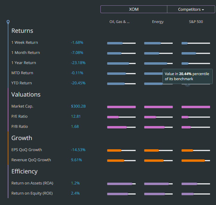
Let’s say you want to buy an energy company right now because you think oil will go up from here. But, you also want to make sure the company is stable and can weather a storm. So you decide, “let’s look at a big energy company like Exxon Mobil.”
You see the P/E ratio for Exxon is 12.81, which looks reasonable. But you don’t know what the context of that number means, so you take a look!
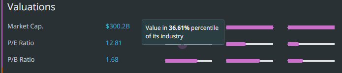
We can see within the “Oil, Gas, and Consumable Fuels” industry the P/E is in the bottom 36th percentile. But what about within the S&P 500? The bottom 19th percentile.
But looking to the right of Exxon, we see Chevron (CVX).
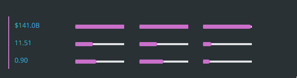
Assuming all else equal, CVX could be a better way to express our play on oil!
2) Comparing 2-3 companies is good, but we want to know if we’re getting the best deal
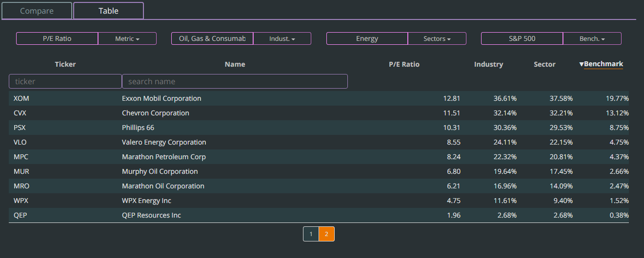
We just compared XOM and CVX, but we at Tiingo don’t feel that’s good enough. Industries, sectors, and benchmarks are filled with companies, so shouldn’t you be allowed to see them all?
We love the idea of data transparency.
With a simple click, you can now see all of the data in tabular form.
In the next few weeks, we will be spending time iterating the current product offerings and making existing features more powerful and accurate. If there is something in particular you would like to see, please E-mail us at [email protected]! We love hearing from our users.